Building Apps with Ai Character Mobile UI KIT
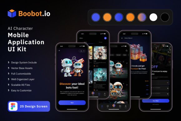
Designing a mobile application from scratch takes time, skill, and a clear vision. For anyone working on a character-based or conversational app, the visual foundation matters even more. The Ai Character Application Mobile UI KIT offers a practical starting point. It includes 25 pixel-perfect screen designs, 80 UI elements, and 100 vector layers, all built for Figma. Whether you are a beginner testing your first idea or a professional refining a polished product, this kit gives you a head start without locking you into rigid templates.
The kit works for different types of creators. A freelancer might use it to prototype a client project in hours instead of days. A small business owner could explore how an AI character app might support customer interactions. An educator might adapt the screens to teach interface design principles. The value is not just in the templates themselves but in how they reduce friction between an idea and a working visual model.
What the Ai Character Application Mobile UI KIT includes
The kit contains 25 screen designs that cover typical flows for a character-based application. You get onboarding screens, conversation views, profile pages, settings panels, and more. Each screen is fully layered in Figma, meaning you can move, hide, or edit every element. The 80 UI elements range from buttons and input fields to avatars and chat bubbles. The 100 vector layers are fully scalable, so resizing for different devices does not break the layout.
Symbol objects are included as well. These are reusable components that keep your project consistent. Change a color style once, and it updates across all related symbols. The free icon vector set adds flexibility without requiring extra purchases. The font is free too, which lowers the barrier for anyone on a tight budget. All images in previews are placeholders and not included in the download, but that is standard for most UI kits.
Why different audiences care about this kit
A beginner might worry about starting with a blank canvas. Having 25 ready-made screens removes that intimidation. You can open the file, see how a character app is structured, and begin customizing immediately. There is no need to learn advanced Figma techniques just to get started. The templates show what goes where and why.
An experienced developer or designer might value the pixel-perfect accuracy and the ease of editing. When you work on multiple projects, consistency saves time. The symbol objects and fully layered structure mean you can extract what you need and drop it into a larger design system. The 100 scalable vectors also help when adapting the app for different screen sizes or orientations.
Creators and entrepreneurs often need to test concepts quickly. With this kit, you can mock up a working prototype in a few hours. Show stakeholders or potential users a realistic interface without writing a single line of code. The 80 UI elements cover most common interaction patterns, so you are not hunting for missing components mid-design.
Ease of use
For someone new to design tools, ease of use is the biggest concern. The Ai Character Application Mobile UI KIT is available for Figma, which has a free tier and a gentle learning curve. The templates are fully editable, meaning you can delete parts you do not need without breaking the rest. Beginners can focus on one screen at a time, changing text, colors, and images as they learn.
Cost
Budgets vary widely. A student or hobbyist may not want to spend heavily on design assets. This kit includes free fonts and free icons, which reduces extra costs. The file itself provides a lot of value for a single purchase. A professional agency might see it as a small investment for saving several days of design time across multiple client projects.
Flexibility
No two apps are identical. You may need to add a screen, remove one, or rearrange the flow entirely. The fully layered and symbol-based structure makes that possible. You can customize the screen as needed by adding or subtracting certain elements. If your app requires a unique onboarding sequence, you can pull from the existing screens and modify them without starting over.
Quality and presentation
First impressions matter. Pixel-perfect designs help your app look professional from the start. The 25 templates are visually consistent, which matters when you present to investors, clients, or beta testers. The 80 UI elements follow a coherent style, so your screens feel like part of one product, not a patchwork of random components.
Practical examples for different reader types
For a freelancer: You land a project for a mental health support app that uses an AI character. You open the kit, pick the conversation screens, customize the chat bubbles to match the brand colors, and replace the placeholder character art with your own. Within two days, you have a clickable prototype to show the client.
For a small business owner: You run a tutoring service and want to explore how an AI character could greet students and answer basic questions. You use the onboarding and profile screens to visualize the student experience. You share the mockup with your team to discuss whether the feature fits your roadmap. No design experience is required to start that conversation.
For an educator: You teach a course on mobile interface design. You use the kit as a real-world example of a complete design system. Students can examine how screens flow together, how symbols maintain consistency, and how layers are organized. They can then customize a screen as a class exercise, learning both technical skills and design thinking.
For a marketer: You need visuals for a landing page or a pitch deck. You export specific screens from the kit to show how the app looks on mobile. The clean, scalable vectors reproduce well at different sizes. You can focus on storytelling instead of waiting for a designer to finish mockups.
Long-term usefulness and learning value
A UI kit like this one does more than speed up a single project. It teaches structure. When you study how the 25 screens are organized, you start recognizing patterns that apply to other app types. The symbol objects show how to maintain consistency at scale. The vector layers demonstrate clean file organization. These lessons transfer to future projects even if you never build a character app again.
The kit also grows with you. A beginner might start by changing colors and text. An intermediate user might restructure entire screens. An advanced designer might extract individual UI elements and integrate them into a larger design system. The kit does not enforce a ceiling on what you can learn or achieve.
Deciding if this kit matches your goals
Ask yourself a few questions. Are you building an app that involves a character or conversational interface? Do you want to skip the early design overhead and focus on your app’s logic and content? Are you looking for a flexible starting point that you can shape to your own needs? If yes, this kit likely aligns with what you are after.
If you need a complete, ready-to-ship design with no edits, a UI kit may require more work than a pre-built theme. But if you value control over the final look and want to adapt screens to your specific brand and flow, the fully editable nature of this kit is a clear advantage.
Consider your skill level honestly. Beginners will find the templates approachable. Experienced users will appreciate the efficiency. The kit does not assume you are already an expert, and it does not waste time explaining basics that a seasoned designer already knows. It simply provides a solid foundation and lets you take it from there.
Practical tips for getting started
Open the file in Figma and take a full walkthrough before editing anything. Look at how screens are grouped and how symbols are named. Understand the layer structure so you know which parts you can safely modify. Change the color style first to see how it propagates through symbols. Then replace placeholder text and images with your own content. Work screen by screen, keeping the user flow in mind rather than jumping between unrelated views.
Use the 80 UI elements as a inventory of building blocks. If your app needs a feature not covered by an existing screen, you can likely assemble it from elements already in the kit. The 100 vector layers give you room to adjust sizes, positions, and proportions without losing quality.
Keep in mind that all images in the preview are for demonstration only and are not included in the download. Plan to supply your own character art, photos, or illustrations. This gives you full control over the visual identity of your app.
Who might find less value
If your project has no character interaction or conversational elements, many of the screens will not apply directly. You could still extract individual UI elements, but the kit is clearly designed with a specific app category in mind. Similarly, if you prefer to design completely from scratch for creative reasons, a pre-built kit might feel like a constraint rather than a launch pad. And if you are looking for a coded, production-ready front-end, this is a design tool resource, not a developer toolkit.
That said, for anyone exploring the growing space of AI character applications, this kit provides a practical, flexible, and well-organized visual foundation. It respects your time without limiting your creativity.